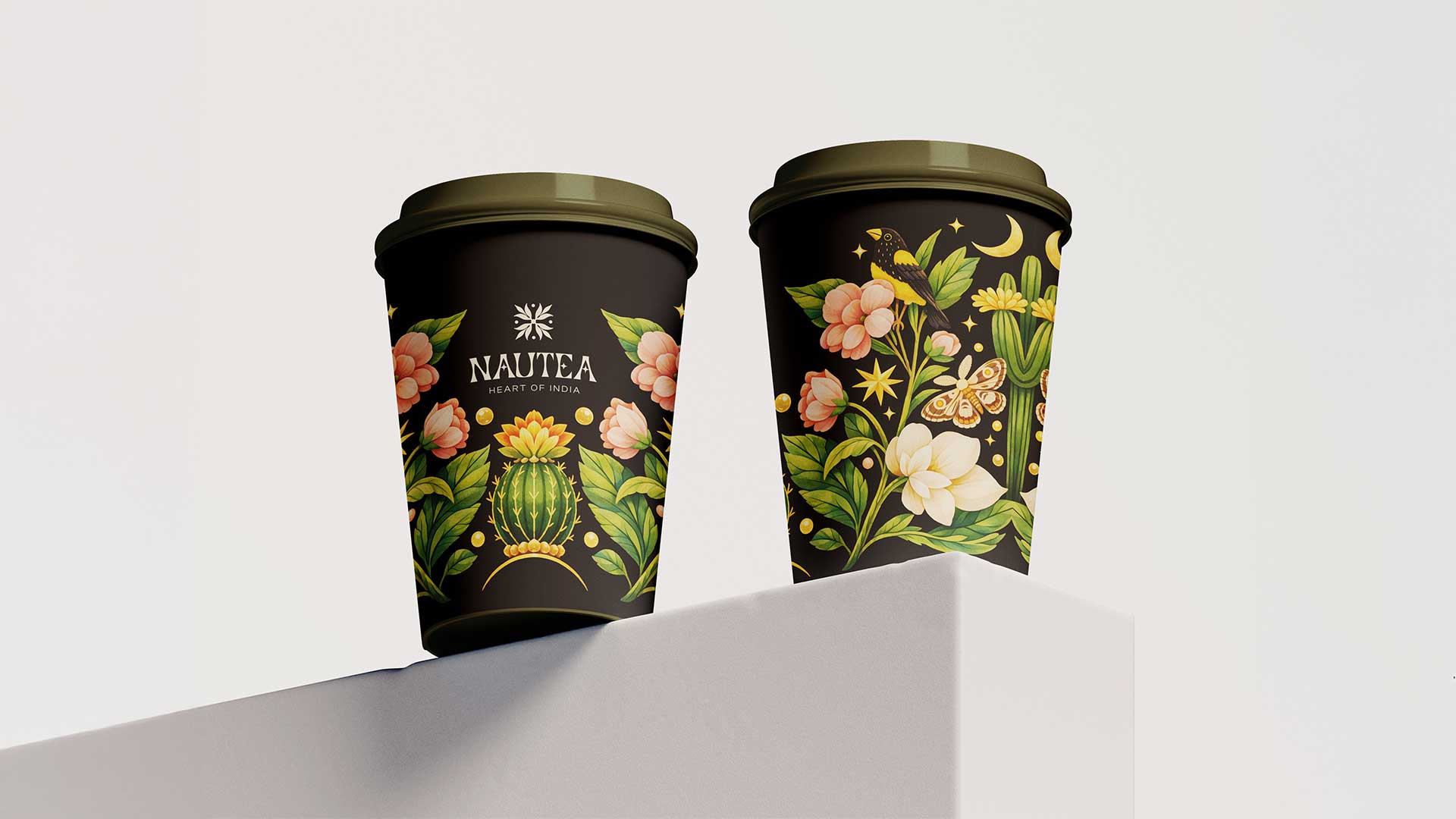
Nautea - Visual Identity

Client
Nautea
Role
Visual Identity
Year
2026
NAUTEA is not just tea; it is an experience. A pause in a busy day.
NAUTEA is a premium tea brand that brings the soul of India into a contemporary, refined experience. Rooted in heritage yet designed for modern tastes, NAUTEA celebrates India's rich tea culture through thoughtfully curated blends and elevated visual storytelling.
A taste of India, reimagined with sophistication.
NAUTEA - Heart of India. Crafted for those who seek flavor, beauty, and quiet indulgence,
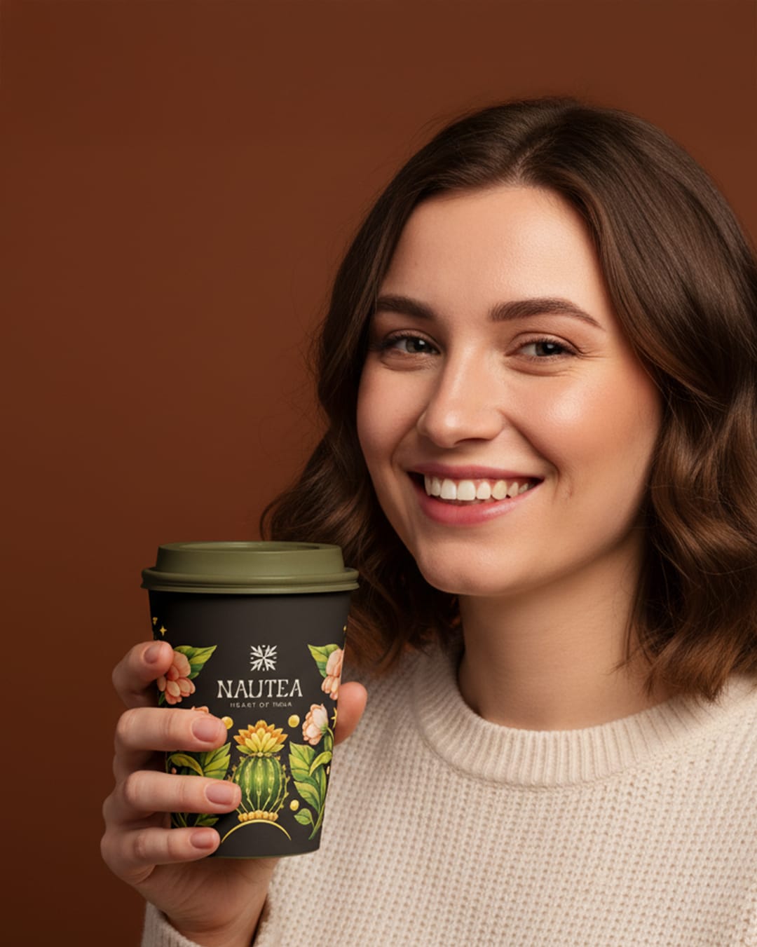


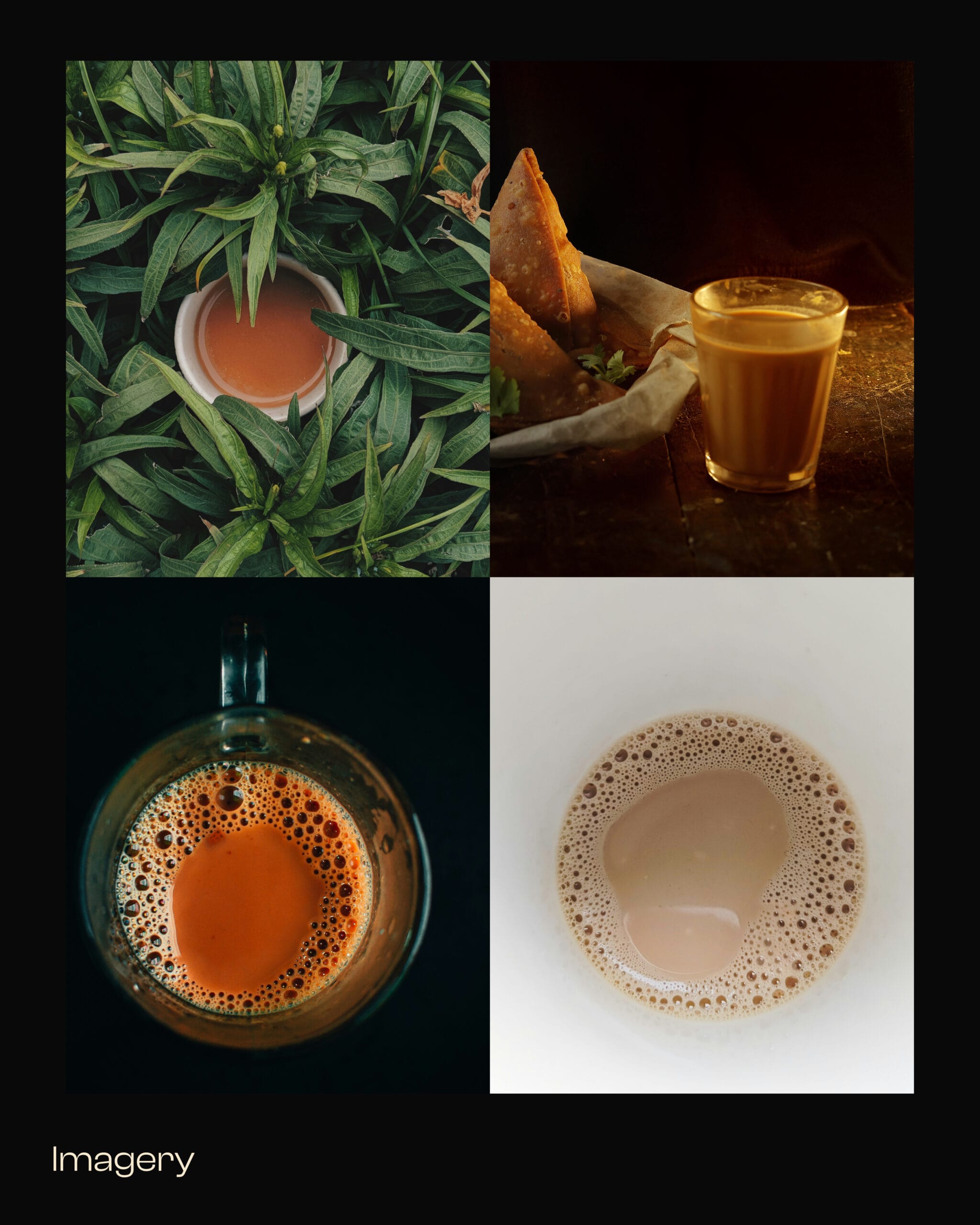
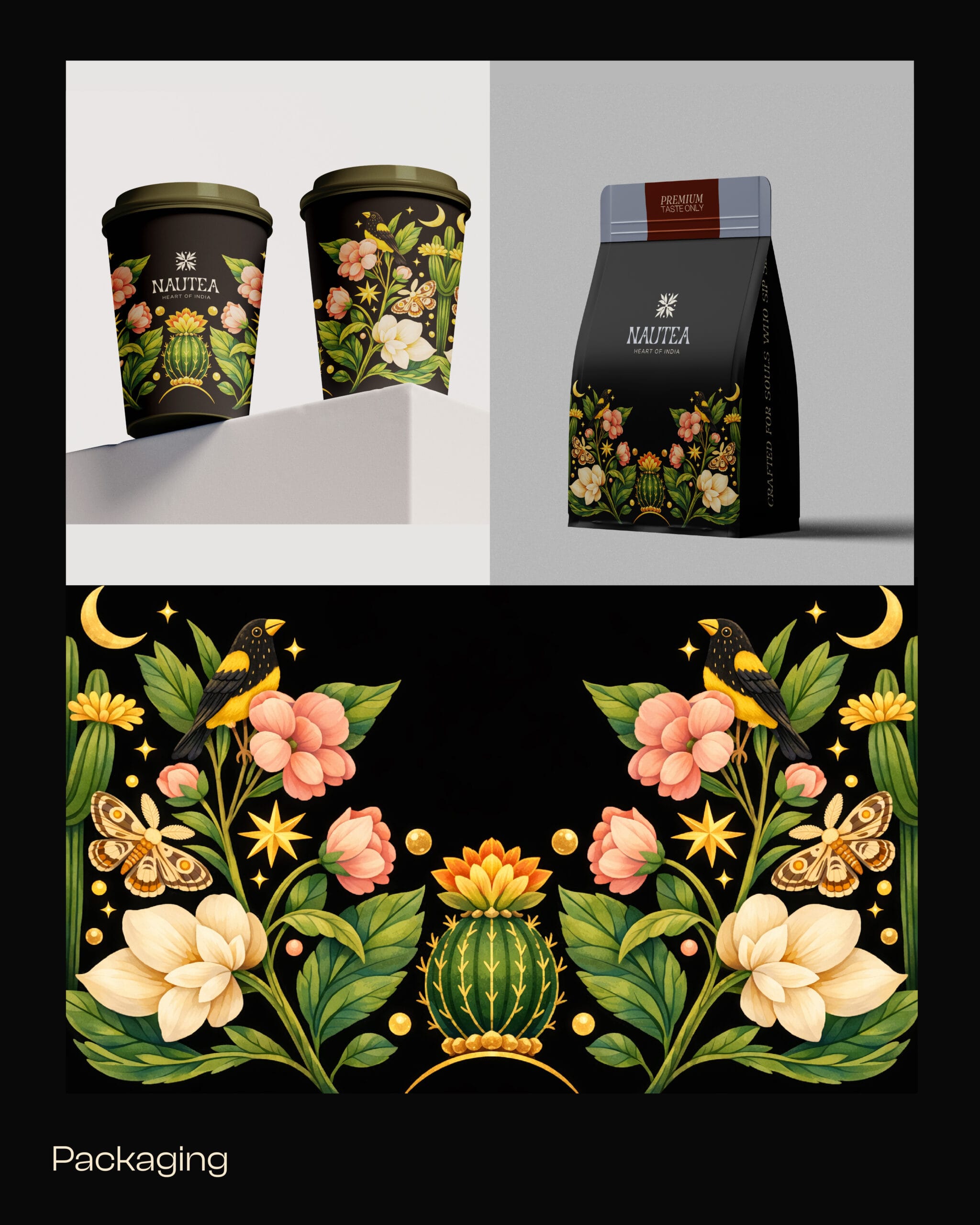
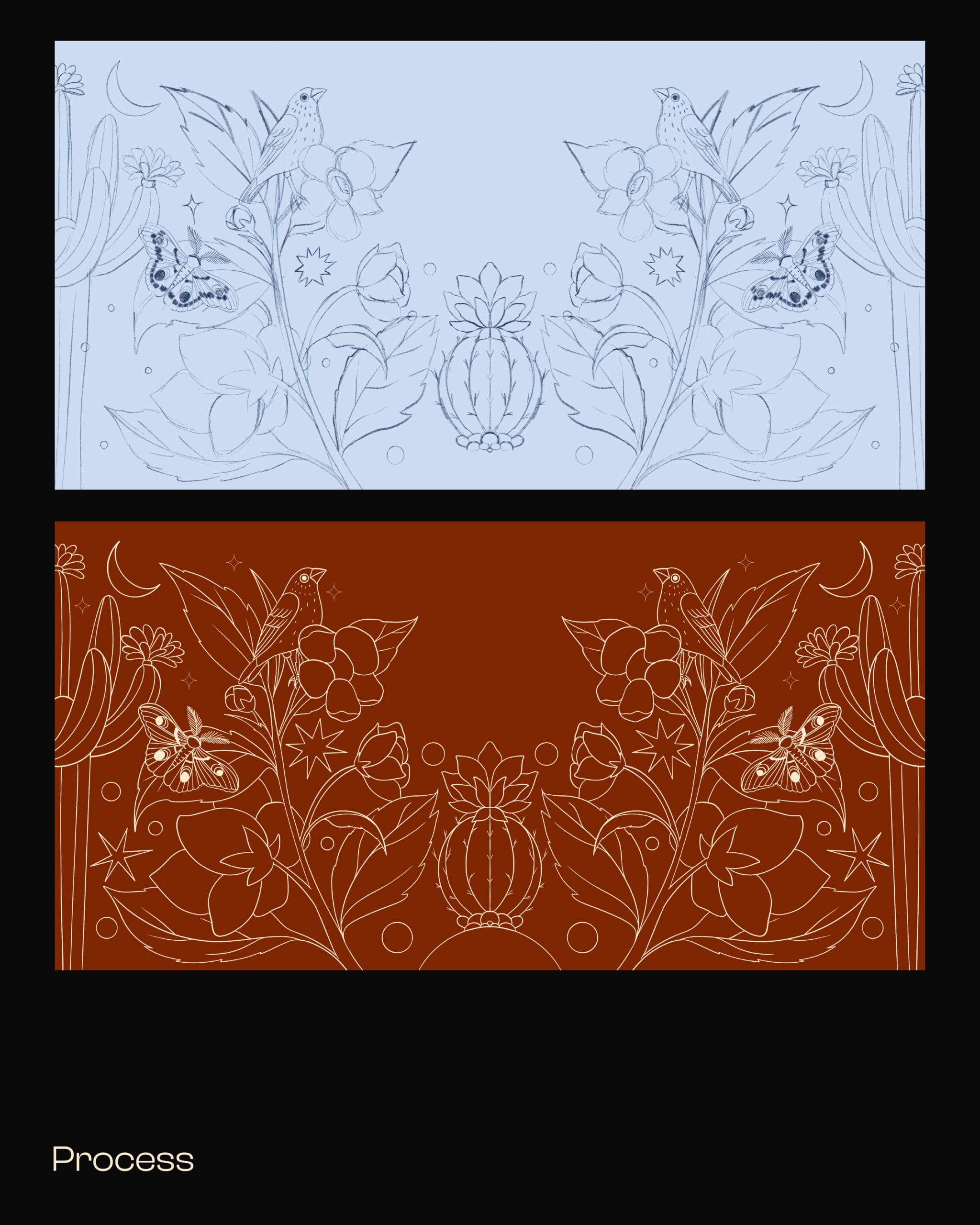
Packaging Process video
Procreate Timelapse
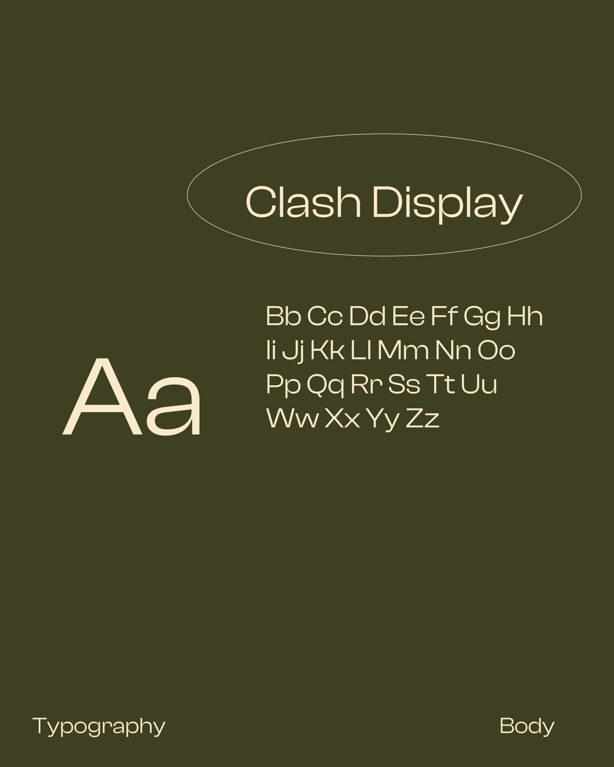
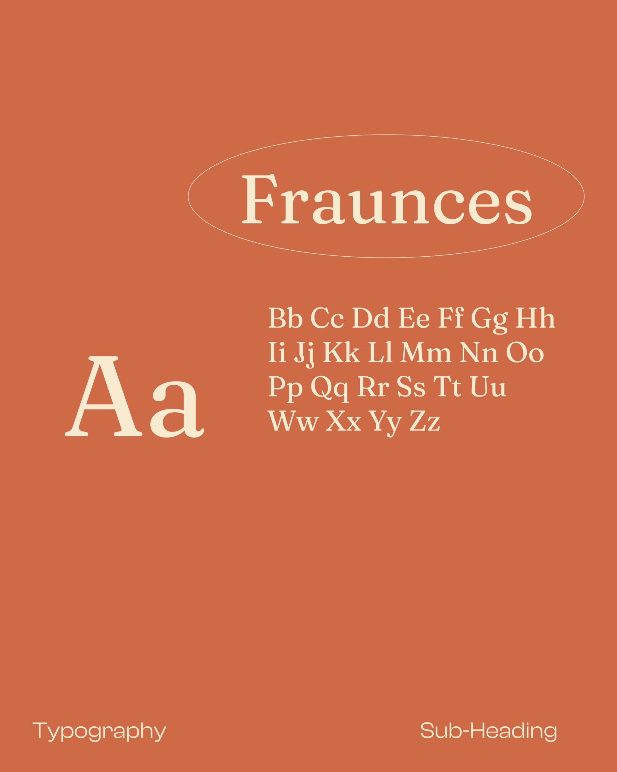
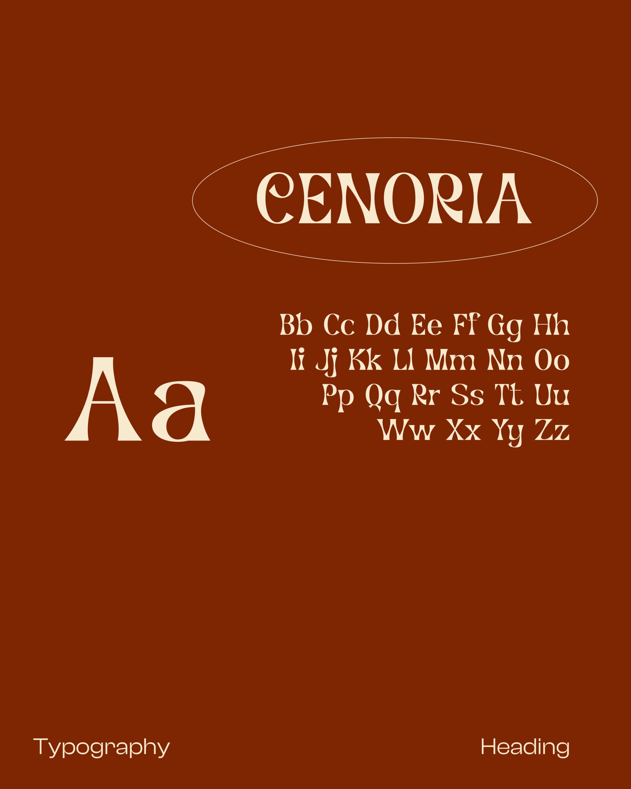
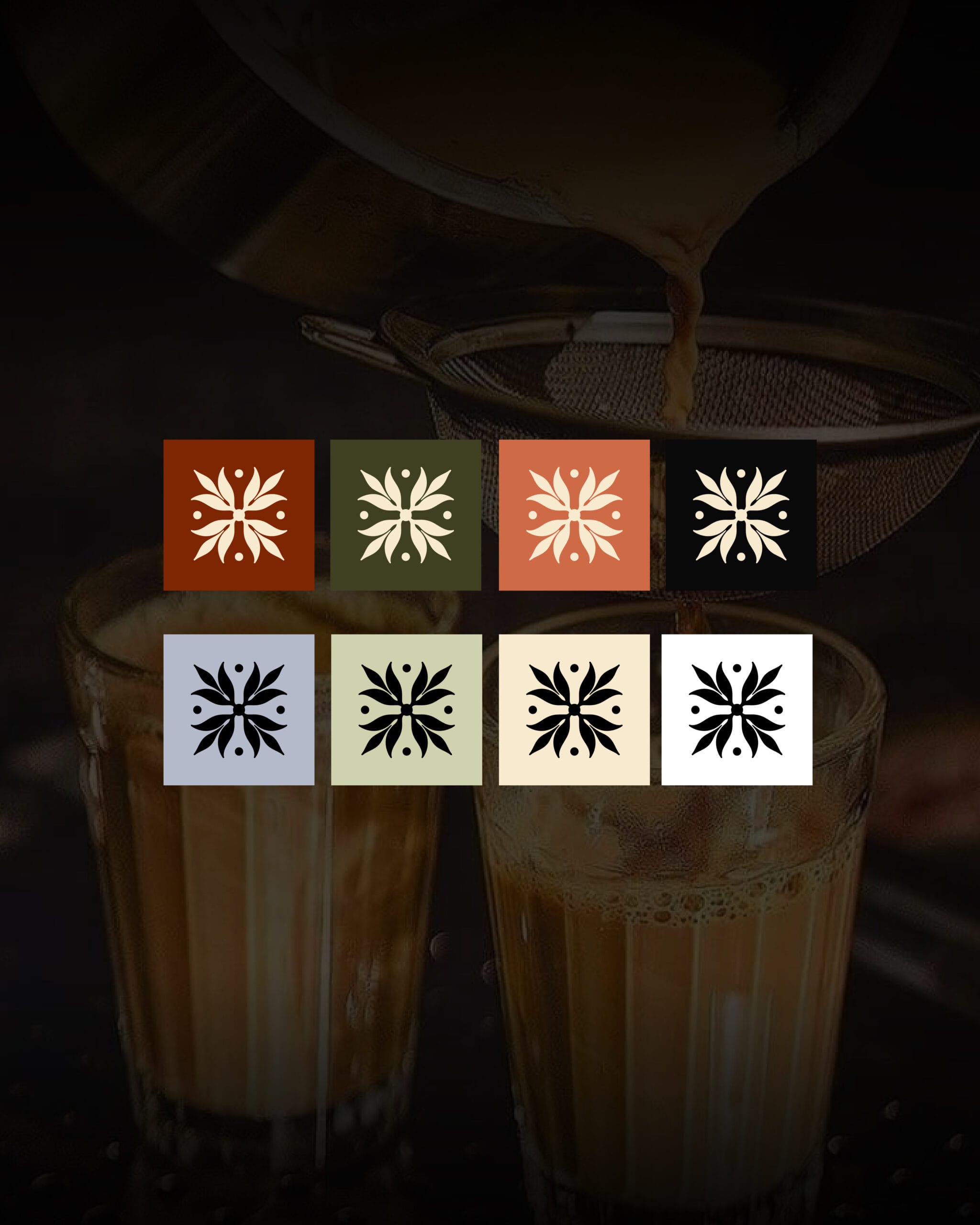
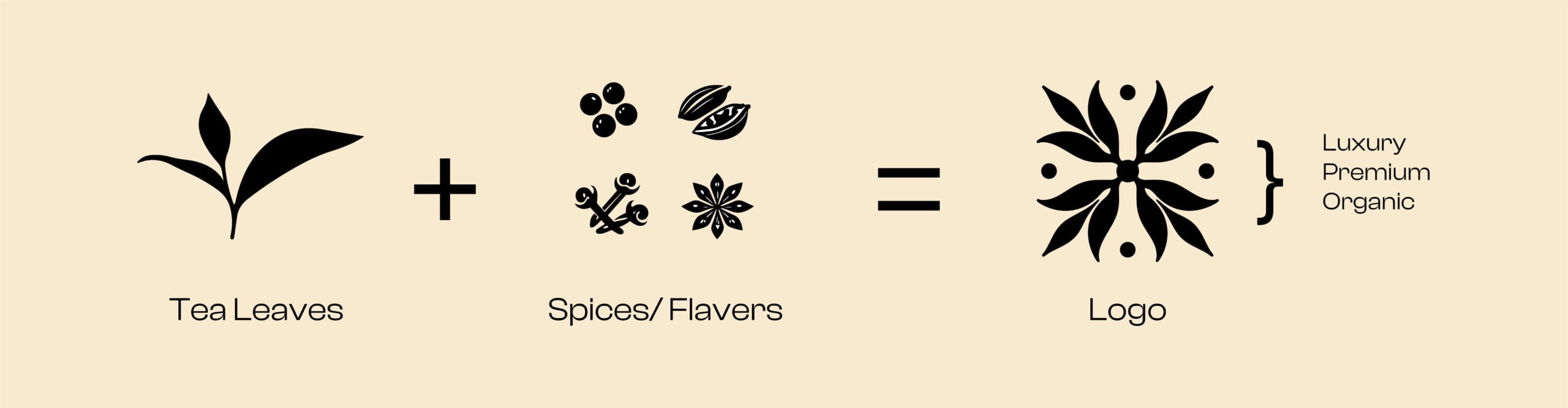

Heritage without the cliches
Complete visual identity design for Nautea, from logo to packaging.
Indian tea has a visual shorthand that everyone reaches for. Marigold, paisley, a lot of gold, a woman in a field at sunrise. It communicates instantly and it flattens a brand into every other brand doing the same thing.
Nautea needed the opposite. A premium tea brand that carries the soul of India, but designed for someone buying in a modern shop and comparing it against contemporary packaging on the same shelf.
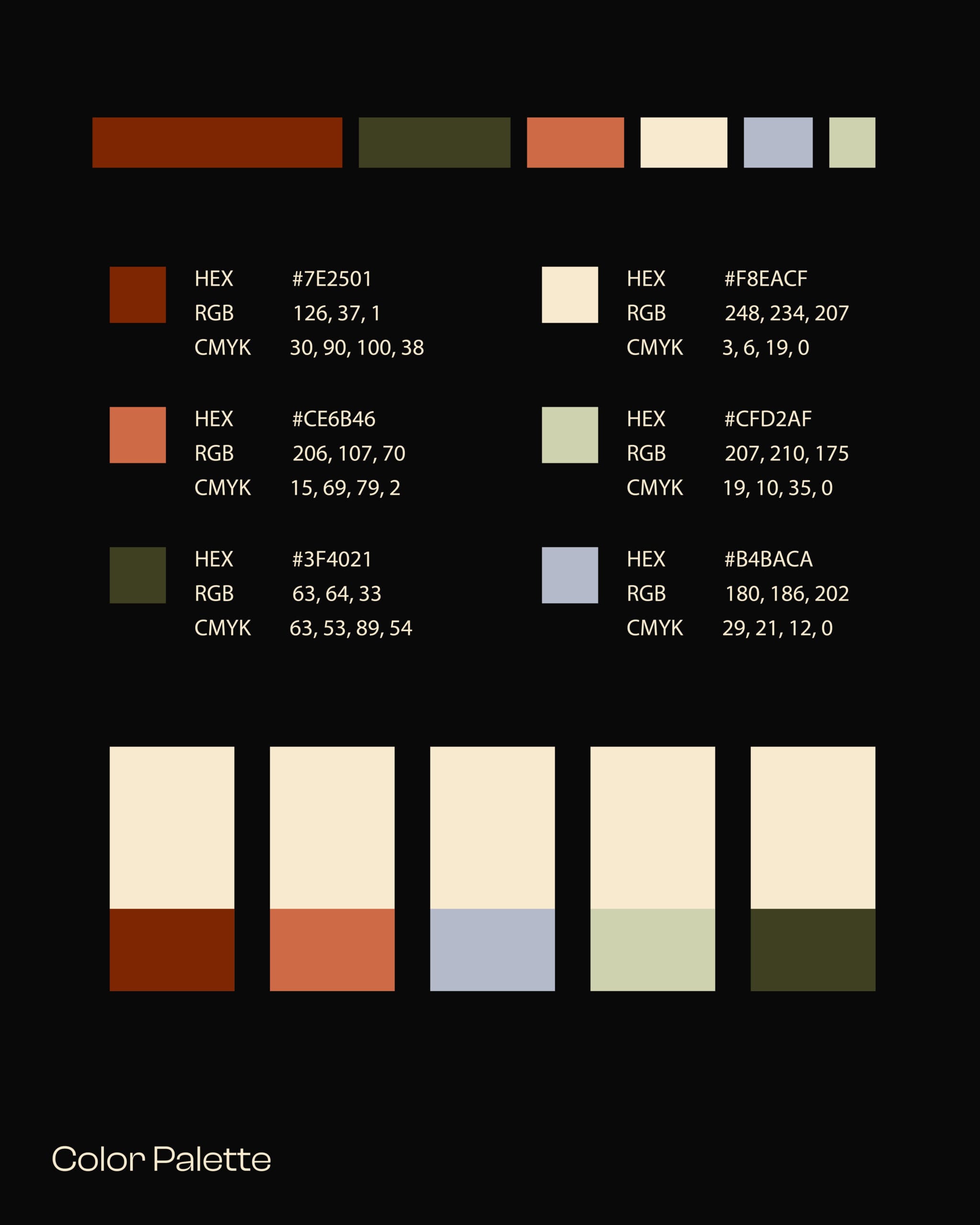
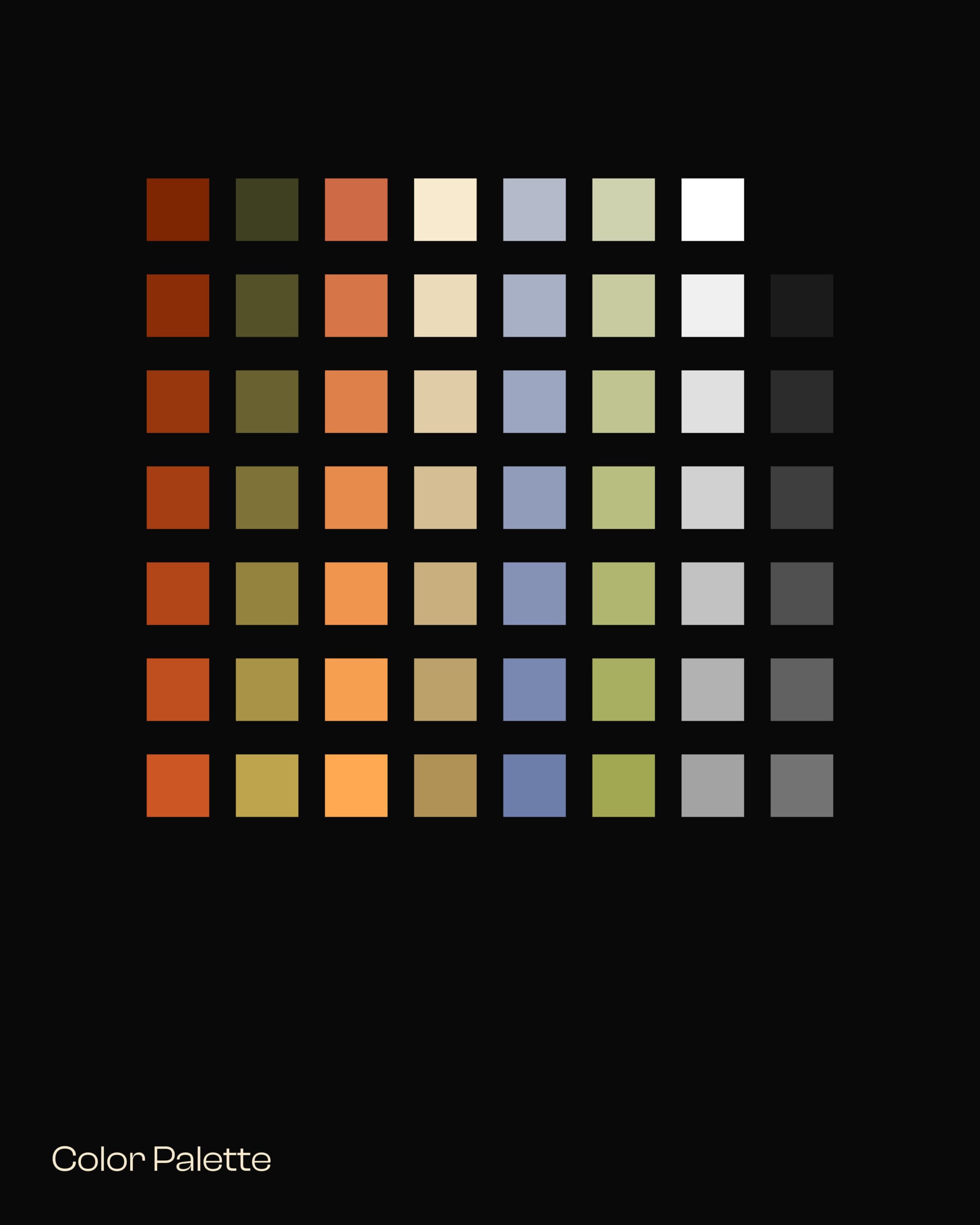
So the identity keeps the heritage in the structure rather than the decoration. Restraint in the palette and the type, warmth in the details, and the Indian character carried through craft and composition instead of applied ornament.
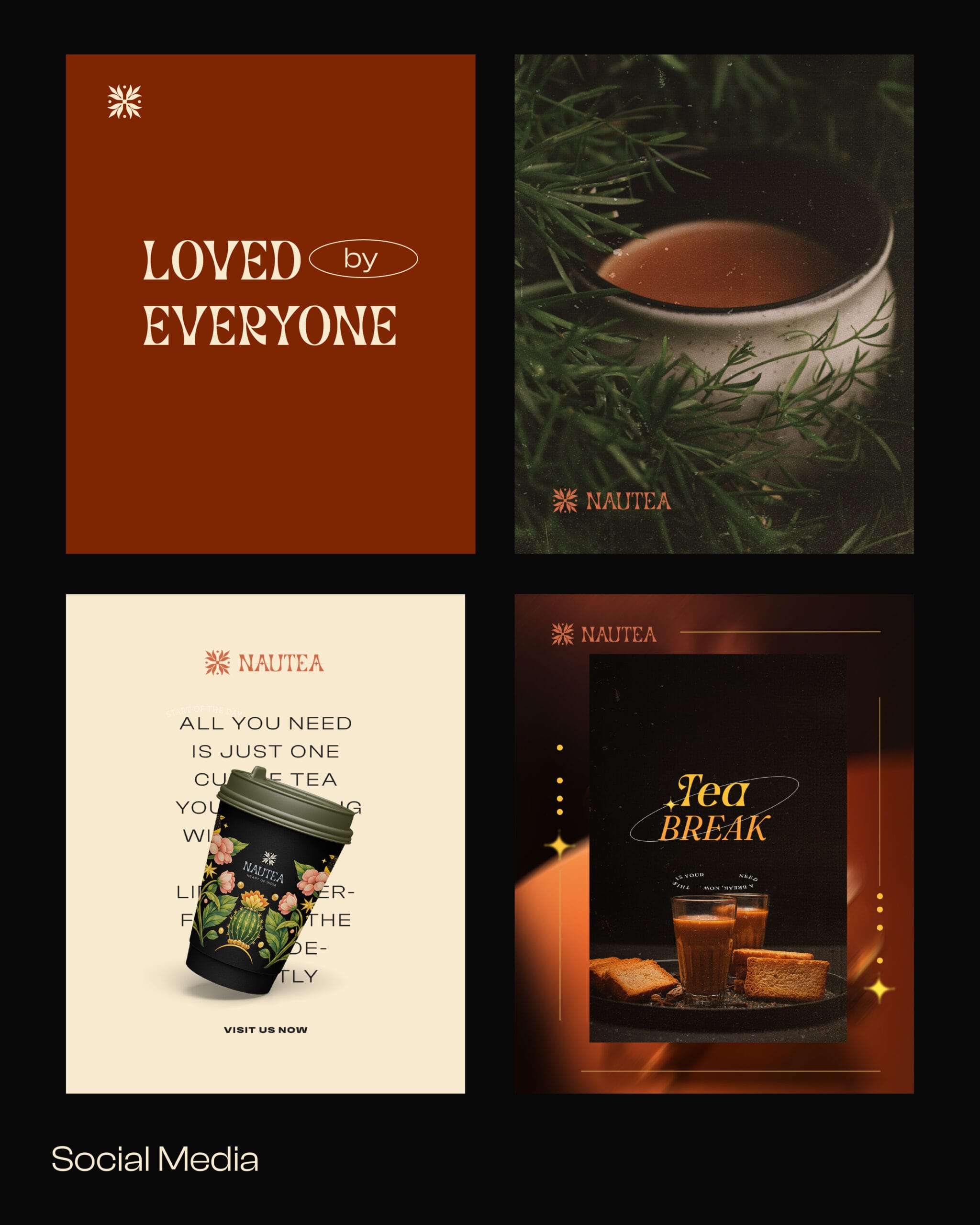
The system then had to survive contact with reality. A logo that works small on a cup and large on a banner, packaging that reads across a shelf, and a set of rules loose enough for the brand to keep making new things without asking permission every time.