Upaj - In App Motion

Client
Upaj by Absolute
Role
Motion design, graphic design, animation, video editing and Lottie animation
Year
2024
From satellite farm mapping to market-ready solutions, our design and animation expertise helped Upaj provide a user-friendly experience that empowers farmers at every step of their journey.
In our collaboration with Upaj, an innovative agritech brand, we crafted a full suite of design and animation solutions to elevate their app for farmers. Our work included:
Onboarding Design: Intuitive and easy-to-follow onboarding flows.
Ideation & Concept Development: Strategic planning and design thinking to refine user experience.
Custom Illustrations: Engaging visuals tailored to the farming community.
Lottie Animations: Dynamic and lightweight animations for a smooth, engaging interface.
In-App Tutorials: Lottie-based interactive tutorials to help farmers understand the app’s features.
Logo Animation: Animated the Upaj logo to create a strong brand presence.
Splash Screen Animation: Designed and animated the splash screen for a welcoming first impression.
Navigation Bar Animation: Animated the nav bar for smooth transitions and usability.
Button Animations: Created engaging, responsive button interactions.
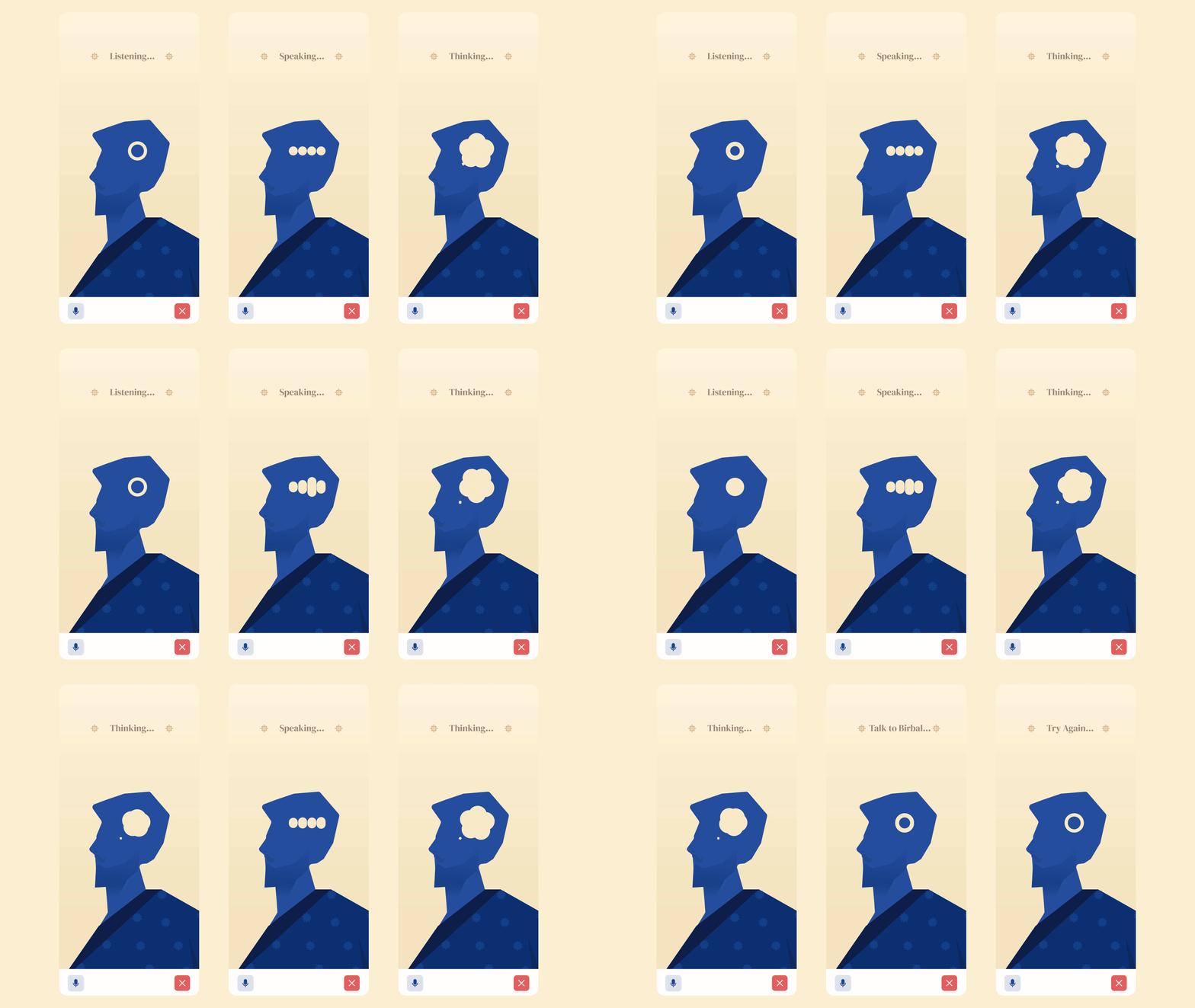
Styleframes & Process
Visual identity research
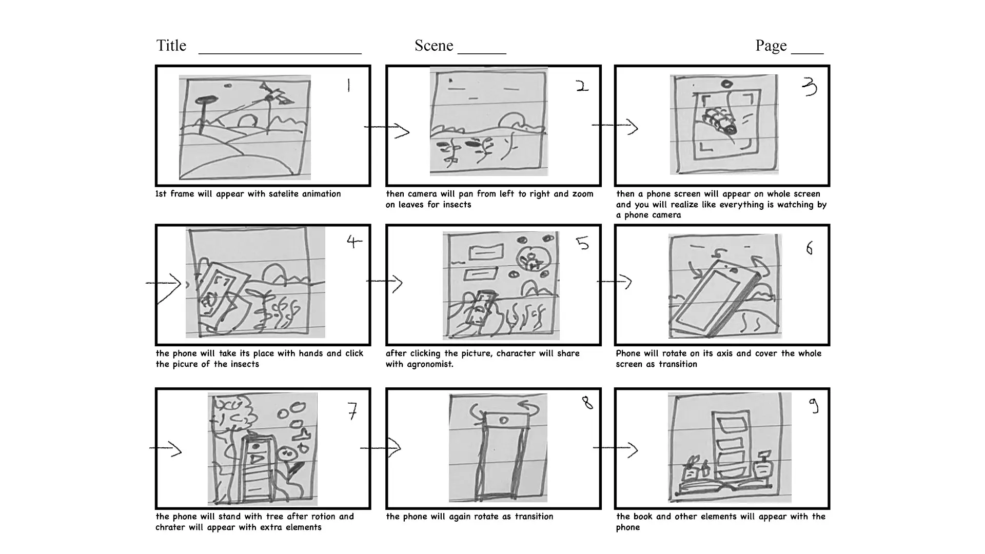
Onboarding animation
Lottie

Nav bar design
Brainstorm



Splash screen animation
Lottie

Nav bar animations
Lottie
Tutorials
Lottie (json)
Animation that has to work on a farmer’s phone
Lottie app animation work spanning onboarding, tutorials and micro-interactions.
Upaj by Absolute is an agritech app used in the field — often on mid-range Android handsets, on patchy rural networks, by people who are not looking for a tutorial. Every animation we made for it had to justify its file size before it justified its craft.
That constraint pointed us at Lottie. Shipping animation as JSON rather than video meant the splash screen, the navigation bar transitions, the button states and the in-app tutorials all stayed small enough to load instantly and sharp enough to hold up at any screen density — the same files, on every device.
The illustration work sat underneath all of it. Rather than reach for generic agritech imagery, we drew for the audience the app actually serves: the crops, tools and people a farmer would recognise. That is what lets the onboarding flow explain satellite farm mapping without ever reading like a manual.
The result is a set of animations that carry their weight twice. They teach the feature, and they make the app feel finished. Logo, splash screen, navigation, buttons and tutorials all speak one visual language.