Custom Branding for Fintech & SaaS Startups: Why Motion Belongs in Your Brand System
Most early-stage brand packages still end where they ended in 2015: a logo, a colour palette, two typefaces, a PDF. Then the founder opens the app, the launch video, the LinkedIn carousel and the onboarding flow, and discovers the brand has nothing to say about how any of it should move.
That gap is where custom branding for tech startups actually gets decided now. Your brand does not live on a business card; it lives in a product where nearly everything animates. If your identity has no motion language, your product invents one by accident — usually inconsistently, usually with whatever easing the component library shipped with.
The short version
- A 2026 identity is incomplete without a motion layer: an animated wordmark, a kinetic mark, and rules for how UI motion behaves.
- Agency research published this year puts motion-first identity systems roughly a third ahead of static systems on digital engagement — directionally, motion is no longer decoration.
- In fintech, motion does a specific job: it buys trust while things are loading, verifying, or moving money.
- You do not need a huge engagement. Three or four well-chosen assets change every asset you make afterwards.
Why a static logo is now an incomplete deliverable
Think about where a startup brand is genuinely encountered today: a product UI, an app store listing, a launch video, a demo recording, a paid social frame, an in-app empty state, a loading screen. Six of those seven move. The seventh probably should.
Current practice reflects that. A complete logo system in 2026 is expected to include a primary lockup, a secondary horizontal variant, a standalone icon or mark, a wordmark-only version — and a motion file for each. Not a nice-to-have deck slide. A file, in a format your developers and your editors can both use.
There is a second force pushing the same way. In categories where the product features are commoditised — SaaS, AI tooling, consumer fintech — typography and motion are doing the differentiating work that features used to. Bold, specific letterforms and a recognisable motion signature are what people actually remember.
What a motion-ready brand system contains
| Layer | What you get | Where it is used |
|---|---|---|
| Animated wordmark | 3–5 second build and resolve, plus a short loop | Video intros and outros, app splash, event screens |
| Kinetic mark | Icon that animates on its own — loader and success variants | App loading states, favicons, product moments |
| Motion principles | Duration bands, easing curves, entrance and exit rules | Design system, developer handoff |
| Micro-interaction pack | 8–10 dev-ready Lottie or Rive files | Toggles, empty states, confirmations, progress |
| Narrative template | Reusable explainer structure with brand typography and transitions | Feature launches, sales decks, onboarding |
| Social kit | Sized, captioned templates from the same system | LinkedIn, X, app store previews |
The point of writing it down as a system rather than commissioning assets one at a time is compounding. Once duration, easing and entrance rules exist, every future animation — made by us, by your designer, or by a contractor at 11pm before a launch — lands inside the same brand.
Fintech has a specific problem: trust at speed
Fintech and SaaS founders often ask for motion because it looks modern. That is the least interesting reason to use it. In a financial product, motion is doing something much more concrete: it is managing the moments where a user is asked to wait, to verify, or to trust.
A bank connection that takes four seconds with a spinner feels broken. The same four seconds with a purposeful animation that shows data moving from bank to app feels like competence. Nothing changed technically — the perceived reliability did.
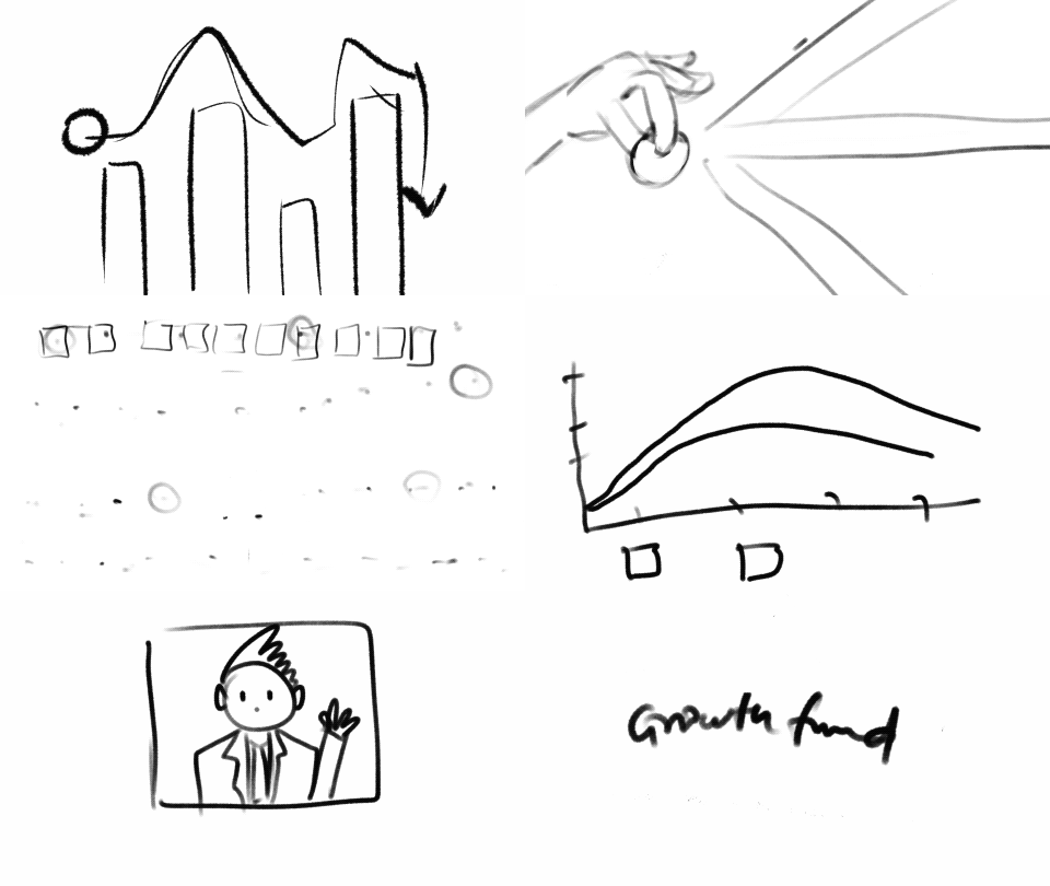
Three fintech-specific jobs motion does well:
- Explaining the invisible. Consent flows, aggregation, credit decisioning, settlement — nobody can see these, so they have to be shown. This is what an explainer is for.
- Covering latency with meaning. Replace generic spinners with motion that describes what is happening. Same wait, different feeling.
- Confirming irreversible actions. A payment sent, a mandate approved, a limit raised. A distinct, branded success moment reduces support tickets that begin with did it work?
Where startups get the most return, in order
- One product explainer that actually explains the product. It works on the site, in sales calls, in onboarding and in fundraising decks. Highest reuse of anything you will commission.
- An animated logo plus kinetic mark. Small effort, appears in every video and every app launch afterwards.
- A micro-interaction pack for the flows you know are weak — empty states, first-run, loading, success.
- Written motion principles. Cheapest item on the list; prevents the most drift.
- Social and launch templates last, once the language above exists.
How to brief this without wasting three weeks
The briefs that go well are specific about constraints, not about art direction. What we actually need from you:
- The three moments in your product where users hesitate or drop off.
- Where the motion will run — web, iOS, Android, React Native, email — because that decides format before it decides style.
- Who implements it, and whether they can add a runtime. This is the single most common late-stage surprise.
- Your existing design tokens or component library, if there is one.
- Two brands whose motion you like, and one you do not. The negative example saves more time than the positive ones.
Formats follow from that, not from taste. We cover the reasoning in Lottie vs GIF vs MP4 and the tooling in the best UI animation tools in 2026.

Five mistakes we see repeatedly
- Commissioning a brand film before the brand has a motion language. You get a beautiful orphan that nothing else matches.
- Animating the logo and stopping. The logo is the least-used moving element in a product.
- Ignoring weight. A gorgeous onboarding animation that adds three megabytes to first load is a net loss, and your growth team will find out before you do.
- Handing developers a video where a vector file was needed. Or a Rive file when nobody agreed to add the runtime.
- No accessibility fallback. Respect
prefers-reduced-motion. It takes minutes and it is the right thing to do.
What we hand over
We build motion for product teams: explainers, in-app animation, and dev-ready Lottie or Rive files that do not fight your build. Delivery is source files, exported formats, a short motion spec your design system can absorb, and file weights we are willing to be judged on.
If you want to see the range first, our work covers fintech product films, in-app motion and brand identity systems, and services lays out how each engagement runs. There is more on the storytelling side in how motion graphics enhance brand storytelling.
Frequently asked questions
- Do we need brand motion before we have product-market fit?
- You need one explainer and a motion-capable logo. The full system can wait until you are hiring designers who need rules to follow.
- Can our existing brand guidelines be extended instead of redone?
- Usually yes. If you have a solid identity, adding a motion layer is an extension, not a rebrand — and it is much cheaper than starting over.
- How long does a motion identity layer take?
- An animated wordmark and kinetic mark typically run one to two weeks. A full system with micro-interactions and principles is a three to five week engagement depending on how many product flows are in scope.
- Who owns the source files?
- You do. You get the working files, not just the exports — including the layered project and the vector sources.
- What if our developers refuse to add a new runtime?
- Then we design within that constraint from day one and deliver Lottie or optimised video instead. This is exactly why the question belongs in the brief, not in week four.
Give your brand a moving voice.
Motion designed into the brand system, not bolted on later.